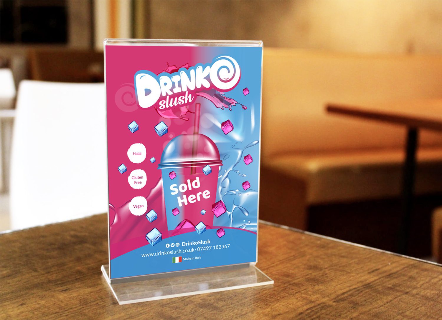
Drinko – Logo Design

Services
  • Brand Guidelines
  • Branding

A logo that tastes as good as the drink

Drinko is a fresh, vibrant slush drink brand targeting a young, social audience. They needed a logo that could stand out on busy shelves, work at small sizes on cups, and feel immediately recognisable across digital and print. The challenge? Create something energetic and memorable without relying on tired fruit imagery clichés.
Simple mark, maximum impact

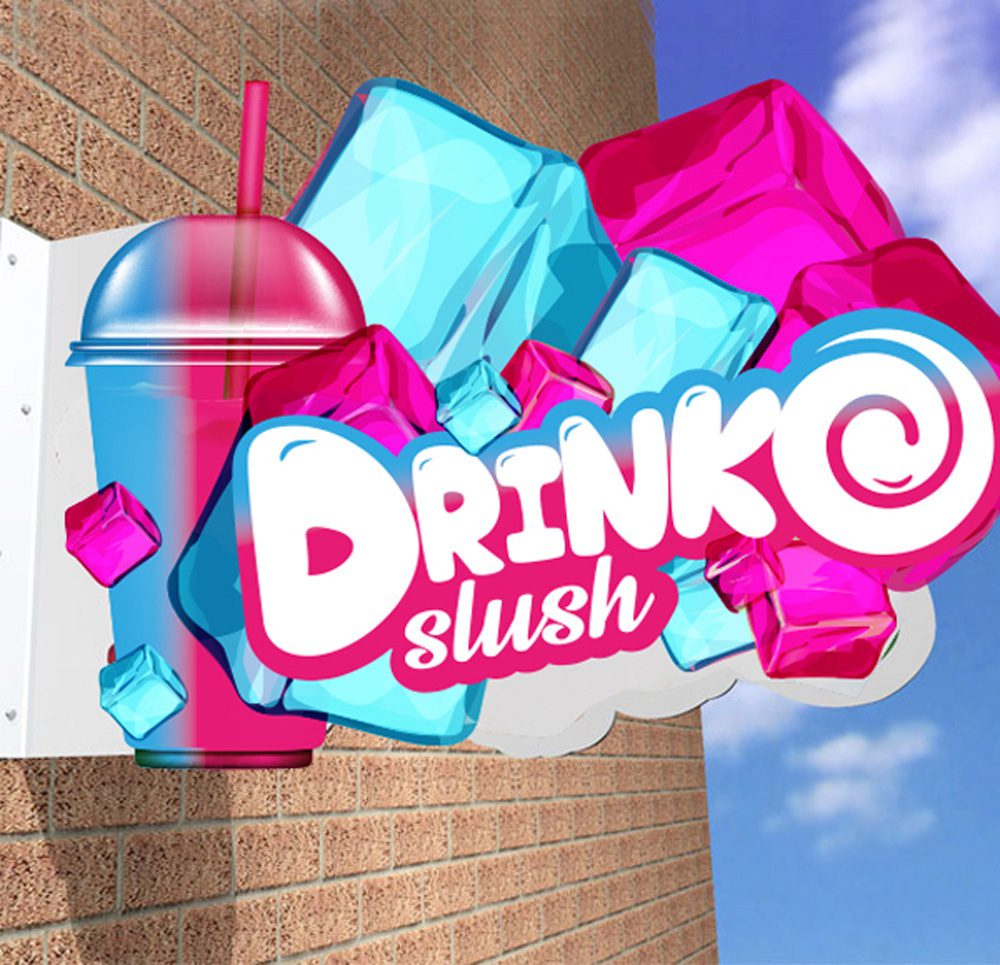
We developed a bold, geometric logo that distils the essence of the brand into a single mark. The design balances playfulness with clarity—it works small on a coffee cup and large on signage without losing legibility or personality.

The supporting colour palette is deliberately vibrant. Bright, fresh tones reference the fruit-forward nature of the product whilst standing out in a crowded drinks category. The colours were chosen to trigger appetite and energy—key emotional drivers for this market.

Tools for consistent application

We delivered a brand guidelines document covering logo usage, colour specifications, minimum sizes, and clear space rules. This ensures Drinko’s team—and any external partners—apply the mark consistently across packaging, digital, and merchandising.

The guidelines also define how the logo works alongside typography and layout, so the brand remains cohesive as it expands across new products and touchpoints.

What we delivered:
  • Logo design
  • Colour palette
  • Brand guidelines
  • Logo application examples
Need a logo that cuts through?

Let’s talk. The first step is an informal conversation.