Every good name tells you something before you’ve read a word of copy. We explored options that balanced the area’s commercial ambition with Battersea’s distinct south London character. “Battersea Business Quarter” landed because it does exactly what a place brand needs to do: it tells you where, it tells you what, and it positions the location as a defined commercial district rather than a vague stretch of postcode.
Building the visual identity
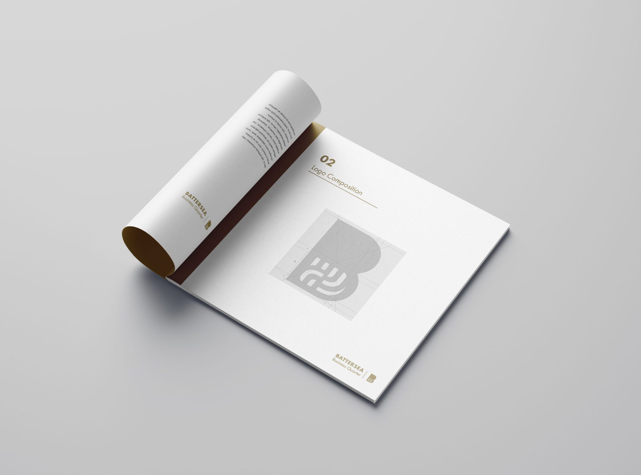
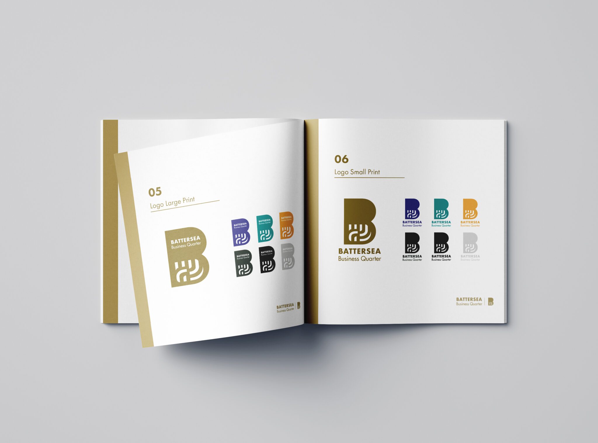
Once the name was in place, we crafted a bold, quietly sophisticated identity to match. The colour palette draws on warm golds and deep, grounded tones — a deliberate move away from the glass-and-chrome aesthetic that dominates most commercial property branding. This is Battersea, not Canary Wharf. The identity needed to feel rooted, modern, and human.
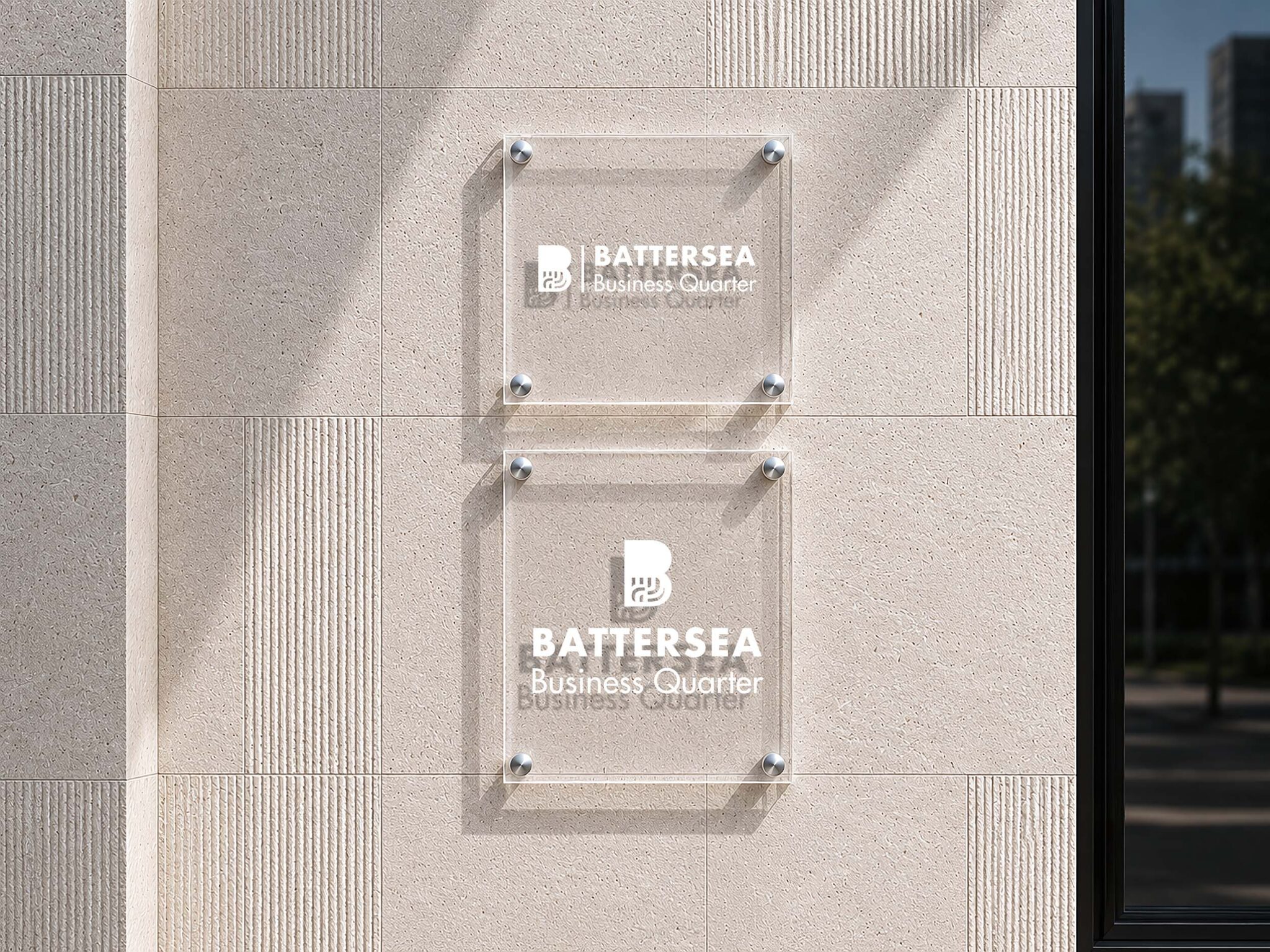
The logo sits at the centre of a flexible system, scaling from brand guidelines and investor-facing documents to digital applications, marketing materials, and social media.