Brand Identity - Design

Services
  • Brand Guidelines
  • Branding
  • Brand Design

Building a brand that reflects structure and strength

When Adkins Group approached us for a brand identity, their brief was clear: They wanted a logo that captured their focus on structure, form, and reliability—both visually and symbolically. As a company grounded in material transformation, they needed a mark that would communicate professionalism and craftsmanship at a glance.

Distinctive by design

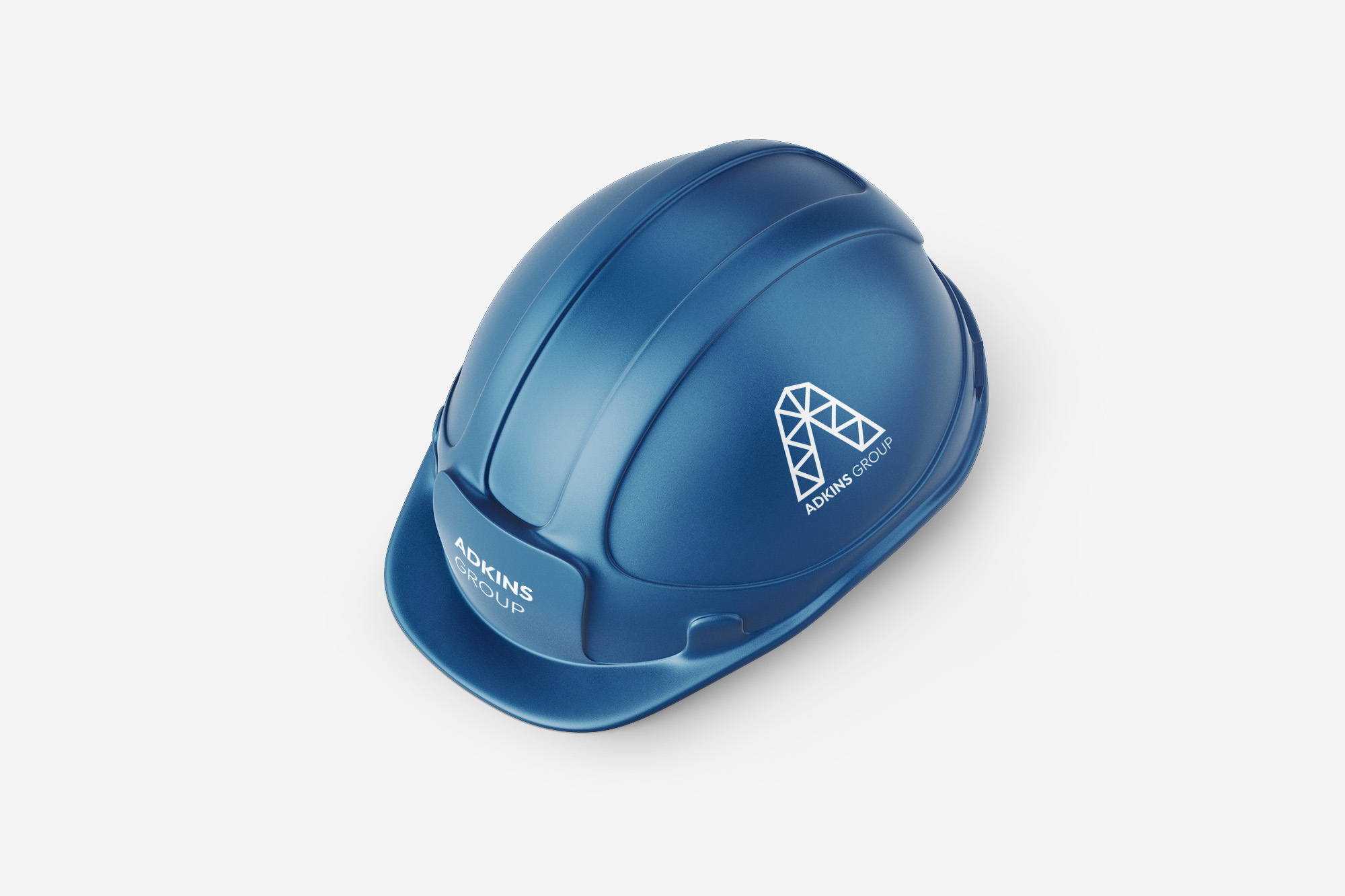
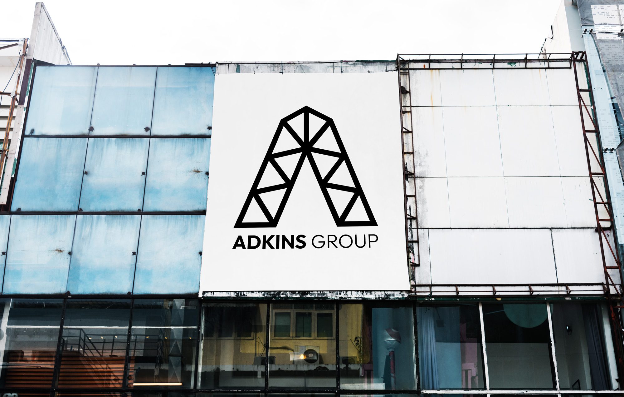
We started with visual research into architectural forms, material grids, and geometric strength. The result? A striking customAbuilt from triangular components—an abstract nod to construction, support, and assembly.

This visual concept does more than stand out—it scales beautifully across surfaces. Whether etched in glass, mounted in steel, or printed on signage, the Adkins Group logo commands attention while communicating clarity and credibility.
Creating brand consistency

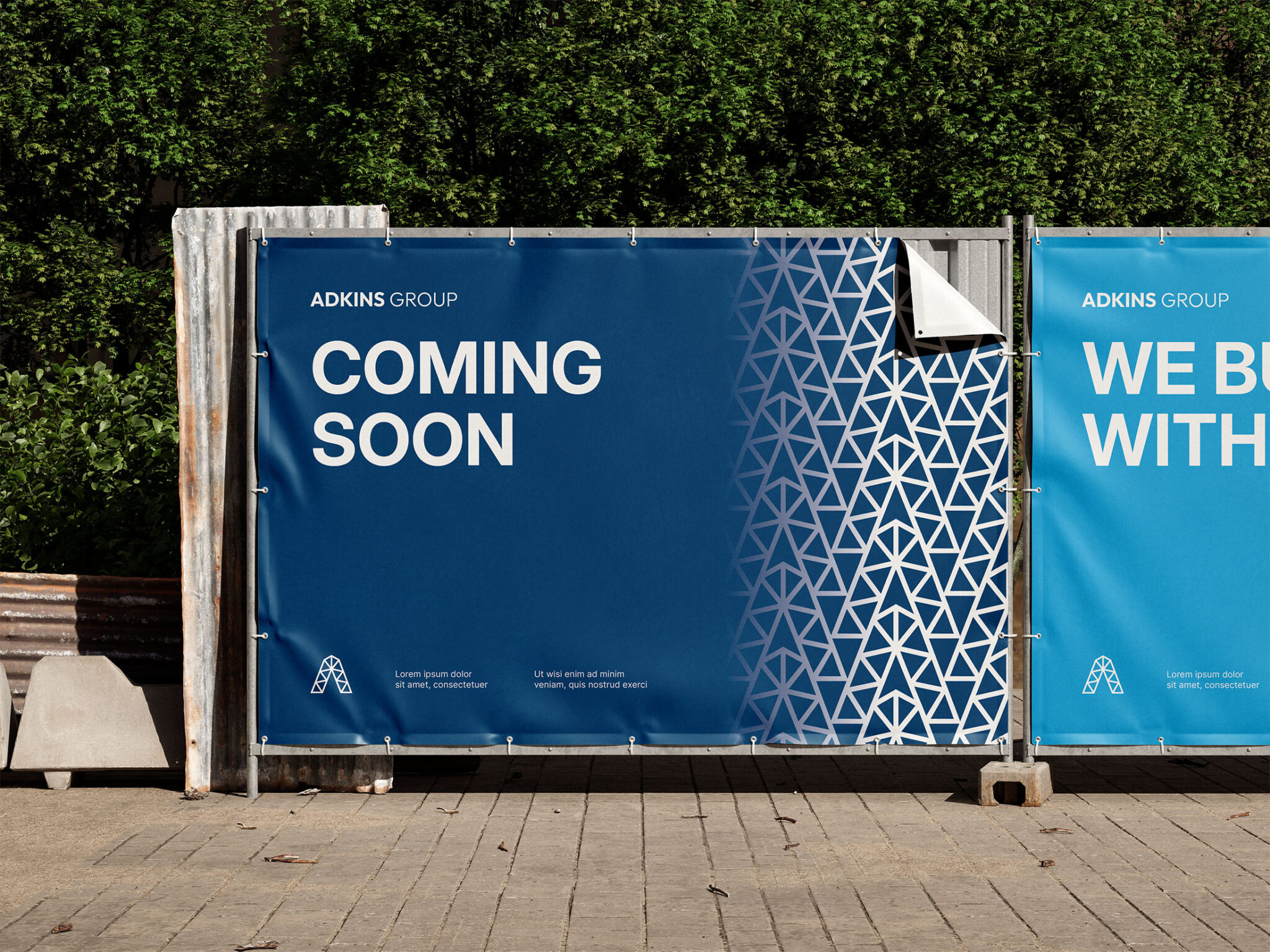
Beyond the logo, we developed a simple yet flexible brand guidelines toolkit that includes logo usage rules, colour options, and typography recommendations. This ensures the identity holds together across print, digital, and physical applications.

From corporate signage to storefront presence, this identity is designed to work hard and look smart in every environment.

What we delivered:

  • Logo design
  • Brand identity system
  • Brand guidelines

A brand that reflects what they build

Clean, confident, and structurally inspired, the new Adkins Group identity directly reflects its team’s work ethic and expertise. At Design JD, we don’t just create logos—we shape visual stories that endure.


Need a bold identity that speaks your language?
Let’s build it together. Start a conversation