Brand Identity

Services
  • Brand Guidelines
  • Branding
  • Brand Design

The Challenge

An identity rooted in place

Riverside Business Park needed a brand that communicated clearly to tenants, visitors, and stakeholders. The existing identity lacked definition, it didn’t reflect the quality of the location or help the park stand out in a competitive commercial property market.
Starting on paper

Every strong identity starts with exploration. Our design team began with hand-drawn sketches, testing dozens of approaches, monograms, abstract forms, wordmarks to find how ‘RBP’ could be expressed with simplicity and impact.

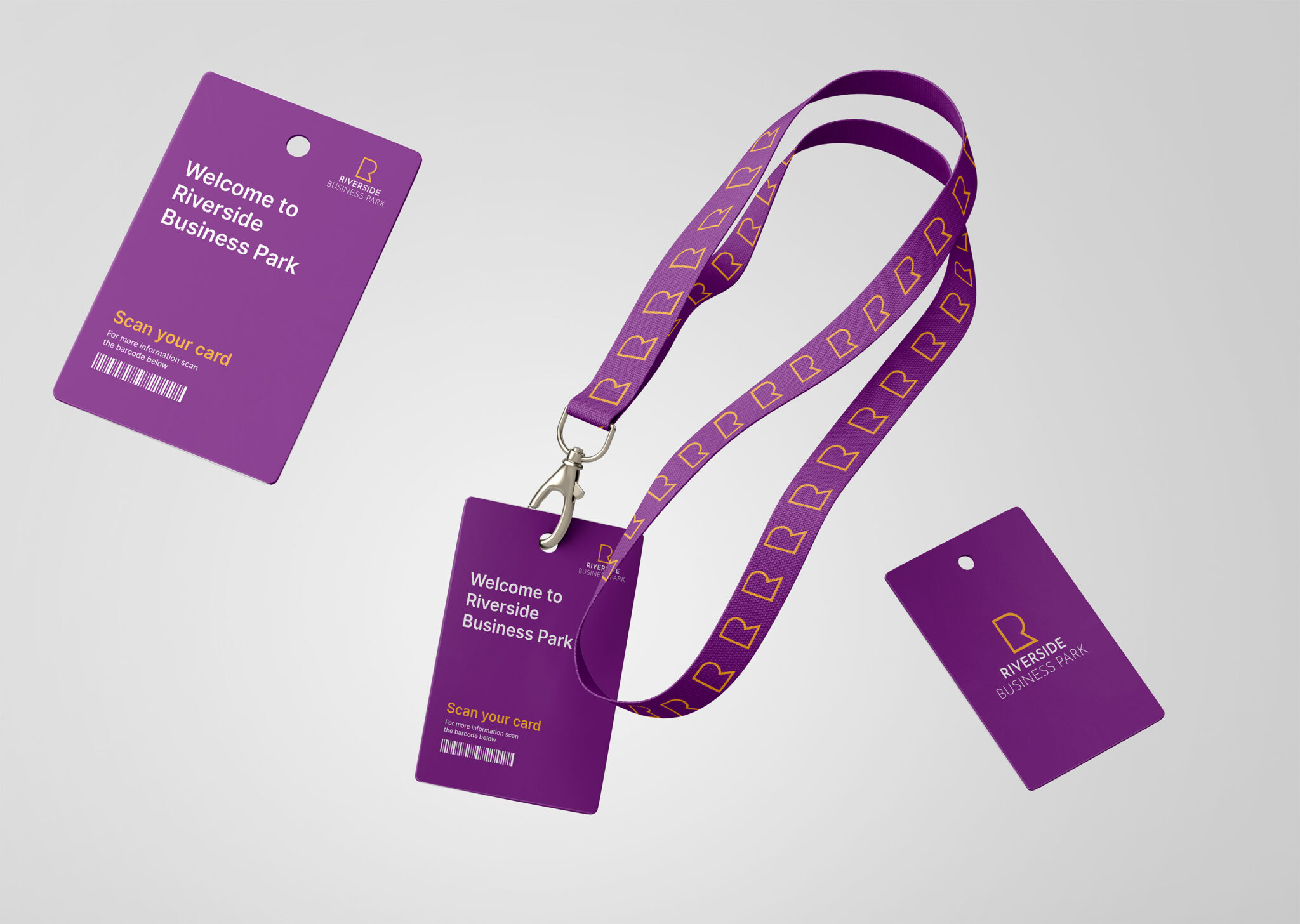
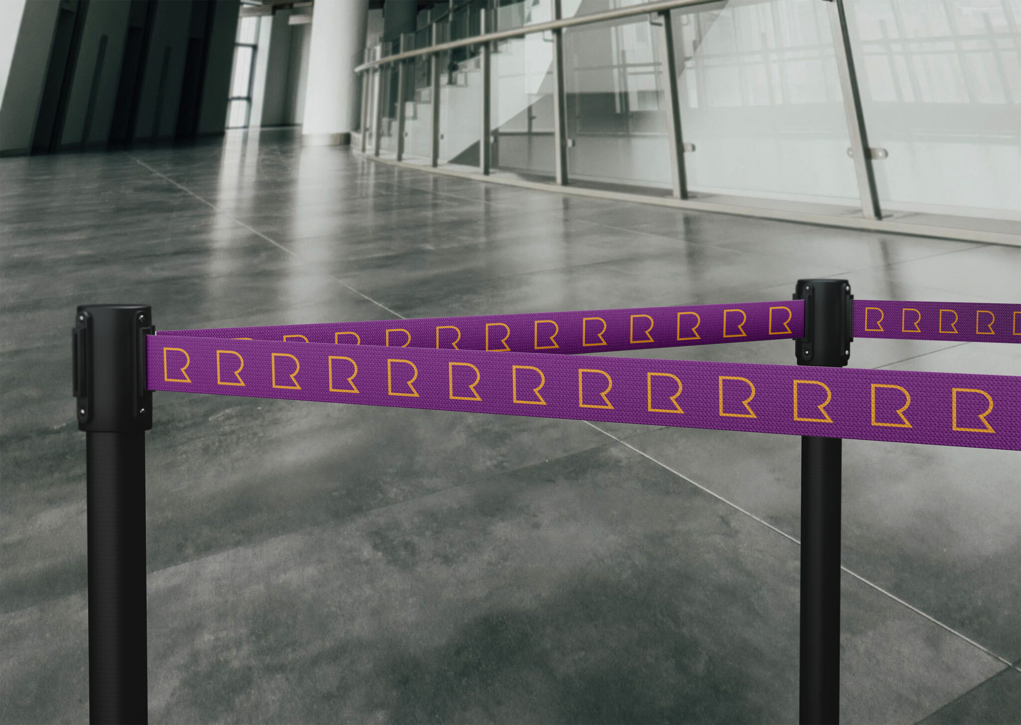
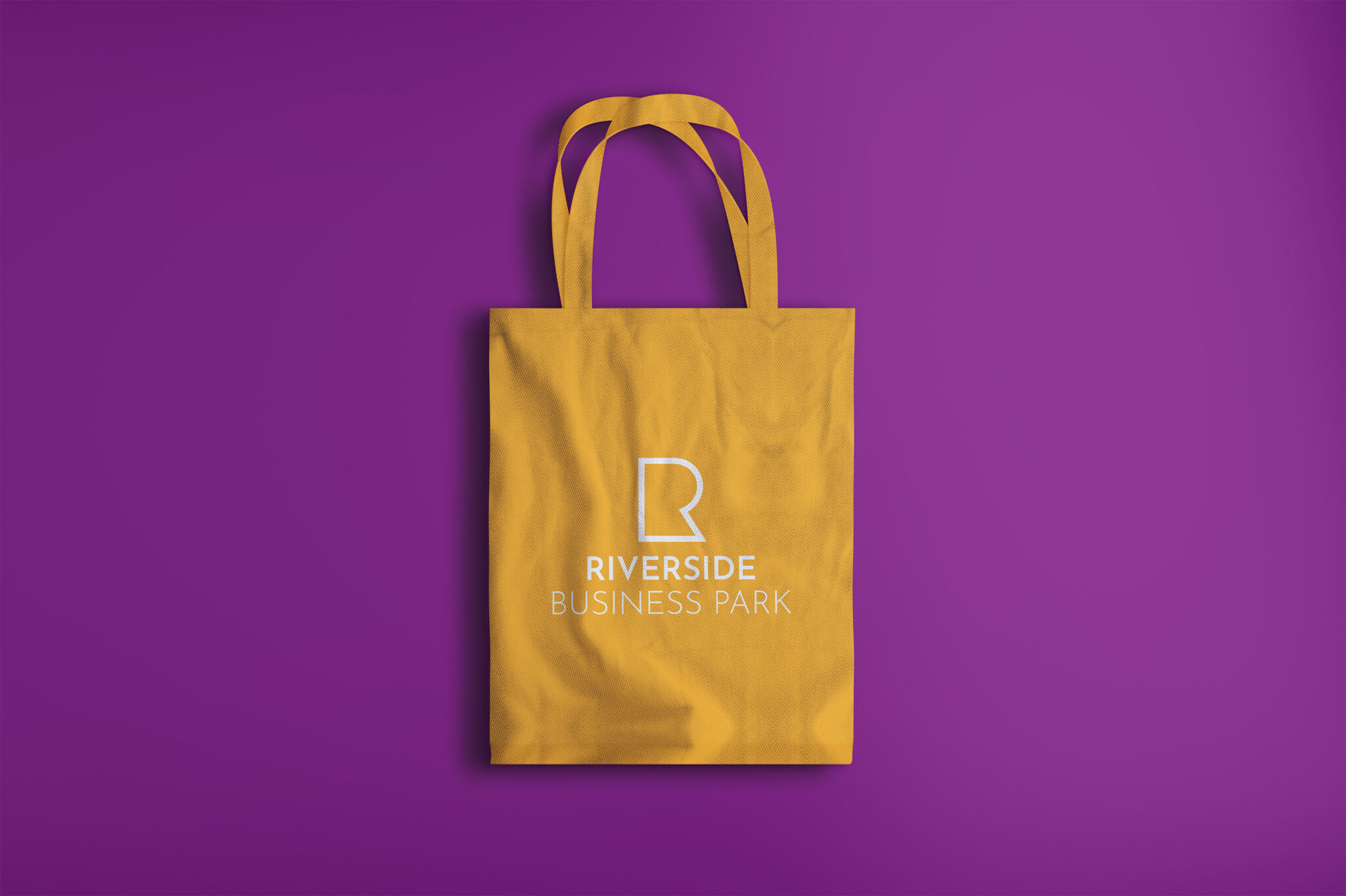
We presented a range of directions to the client, then refined the strongest concepts into polished digital designs. The chosen identity combines a clean letterform with a versatile colour palette — immediately recognisable and adaptable across signage, print, and digital.

A complete brand system

Beyond the logo, we built a full identity system. Comprehensive brand guidelines cover logo variations and spacing, colour specifications, typography, and layout rules. Everything the Riverside team needs to apply the brand consistently, without guesswork.

What we delivered:

  • Brand identity design
  • Logo and lockup variations
  • Comprehensive brand guidelines

Built for flexibility

With a clear identity and practical design toolkit, Riverside Business Park is well-positioned to attract new tenants and communicate with confidence. From early sketches to final rollout, the brand is future-ready and distinctly Riverside.