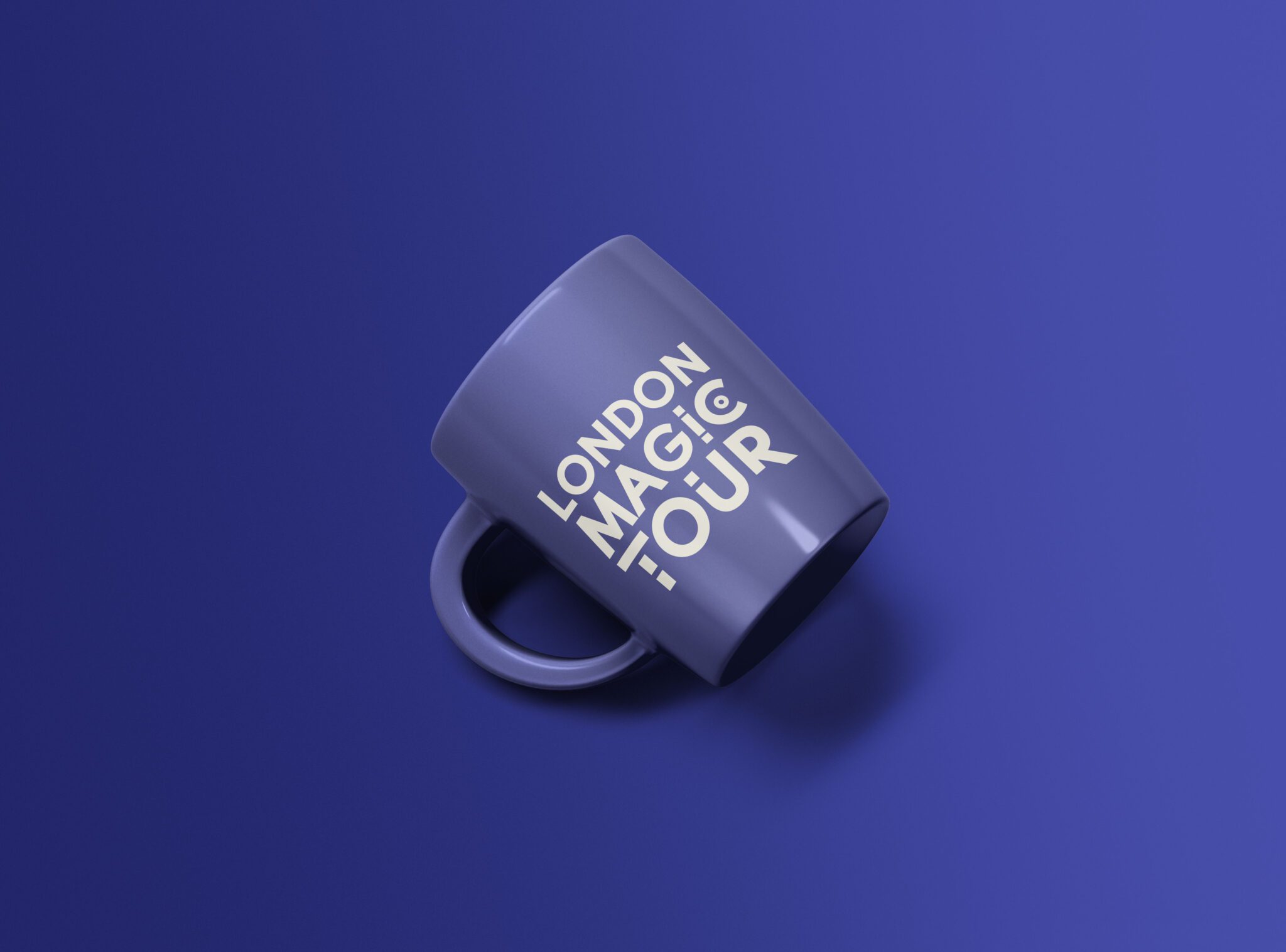
London Magic Tour - Brand Design

Services
  • Branding
  • Brand Guidelines

A brand with years of magical history

Wayne, the director of the Magic in a Trice, decided to start up a brand new entertainment service for families, couples and friends: “London Magic Tour.”

London Magic Tour offers sightseeing experiences across the capital. They needed a brand that could carry that heritage whilst feeling fresh, playful, and instantly recognisable to visitors and tourists. The identity had to work everywhere—wrapped across a double-decker bus, printed on merchandise, and glimpsed for a split second on a busy London street.

The challenge was distilling the sense of wonder and history into a mark bold enough to cut through the noise of a crowded tourism market.

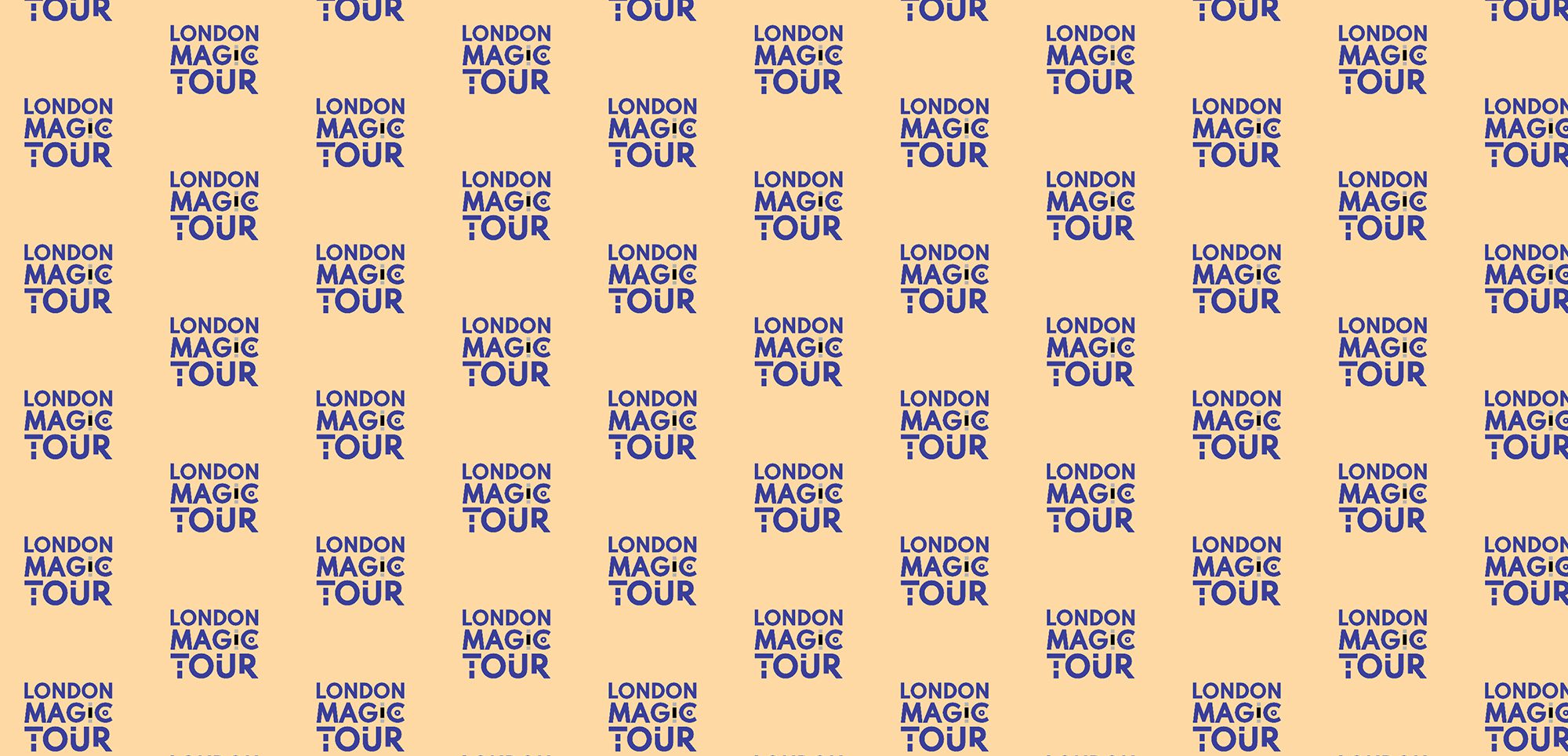
A playful, confident identity

We built the identity around a bold, characterful wordmark. The “London Magic Tour” logotype uses a distinctive treatment—the magic hidden in the details, with a subtle target motif in the ‘C’ that hints at destinations and discovery. It’s confident, memorable, and reads clearly at any scale.

The colour palette pairs a rich royal blue with a warm cream, striking a balance between authority and approachability. The blue signals trust and establishment—fitting for a brand with genuine heritage. The cream keeps it warm and inviting, never corporate or cold.

The wordmark was designed to work as a repeating pattern too, giving the brand flexibility across merchandise, packaging, and environmental applications. This pattern system turns the logo into a recognisable visual language that extends far beyond a single mark.

Built for the real world

We delivered a comprehensive brand guidelines document covering logo usage, colour specifications, typography, and pattern application. This ensures the brand stays consistent whether applied to a bus wrap, a drawstring bag, a mug, or a poster.

The identity was designed for maximum versatility—it needed to survive being scaled up to vehicle size and down to merchandise, always maintaining clarity and impact.

Print that draws the crowds

Beyond the core identity, we designed leaflets and posters to promote the tours. These materials had to grab attention fast—tourists make quick decisions, so the print work needed to communicate the offer, the heritage, and the sense of fun in a single glance. Bold typography, the brand pattern, and clear messaging work together to convert passing interest into ticket sales.

What we delivered:
  • Brand identity and logo design
  • Colour palette and typography
  • Brand pattern system
  • Brand guidelines
  • Leaflet design
  • Poster design
A brand that captures attention and history

London Magic Tour now has a bold, flexible identity that honours its heritage whilst feeling fresh and inviting. From bus wraps to leaflets, every touchpoint communicates the same message: a magical way to experience London.