Body Zest- Brand Design

Services
  • Brand Guidelines
  • Branding
  • Print

A new name for an inherited practice

Luke had taken over his father-in-law’s osteopathic health centre. The practice had a reputation and a patient base. What it didn’t have was a name or an identity that reflected the direction he wanted to take it in.

So the brief started further back than most rebrands: a new name, then a new brand built around it.

Naming came first

Body Zest holds both halves of what the practice does. Body is clinical and unambiguous — this is treatment, delivered by qualified practitioners. Zest is the promise attached to it: energy, movement, getting back to the things you’d stopped doing.

Most healthcare names lean entirely on the first half and end up sounding like a waiting room. This one carries the outcome as well as the service, which is what patients are actually buying.
Clinical enough to trust, warm enough to choose

Healthcare branding has a narrow path to walk. Too clinical and it feels cold. Too soft and patients doubt the expertise.

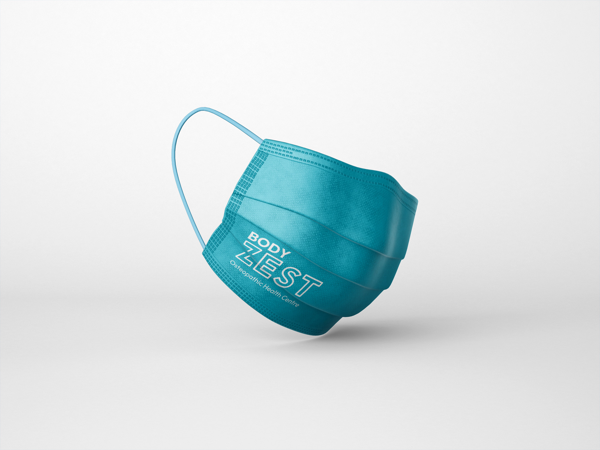
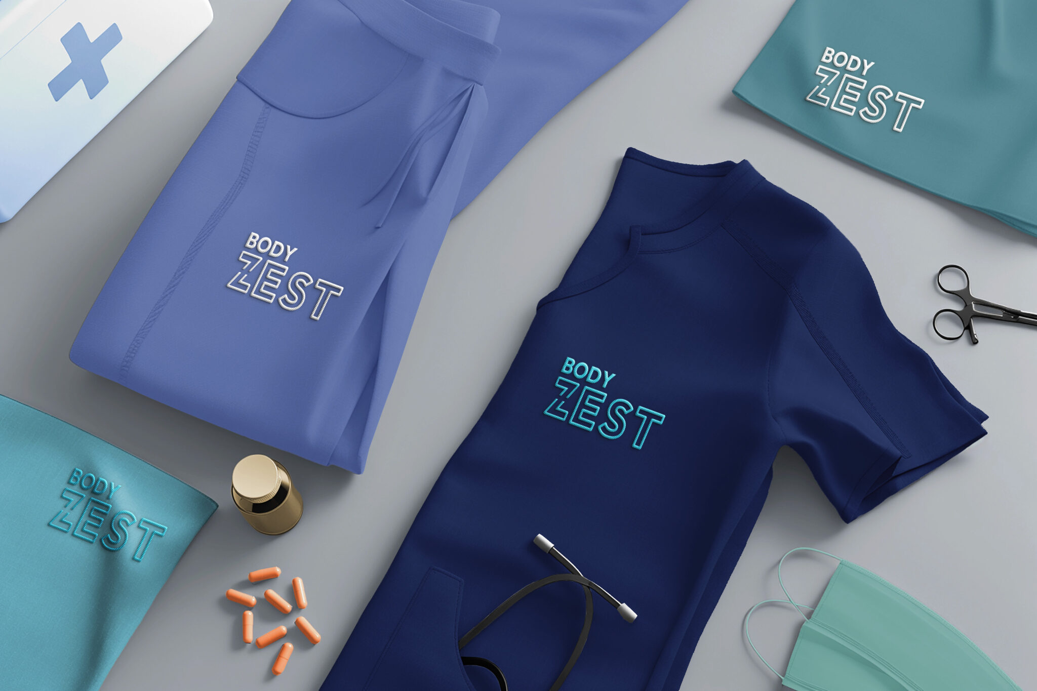
The identity resolves it through colour. Teal keeps the reassurance of traditional medical blue while carrying more life than navy or sterile pale blue would. It reads as healthcare without reading as hospital.

Typography does the rest. A bold, simple sans serif, with small adjustments to the letterforms to stop it feeling like an off-the-shelf choice. Confident and contemporary, easy to read at any size, and it holds up equally well on a business card and across a shopfront.

A palette that keeps the brand fresh

We recommended a secondary palette alongside the core teal. A single colour across every leaflet, card and poster gets monotonous quickly, and a practice producing regular marketing material needs range.

The secondary colours — a warm yellow, a bright green — give that variety while staying within the brand’s character. Energetic without tipping into loud.

The tone was set deliberately wide, because the patient base is. Body Zest treats sports injuries and it treats people managing long-term pain. Someone in their twenties recovering from a rugby match and someone in their seventies who wants to walk further both need to feel the practice is meant for them.

Applied across everything patients touch

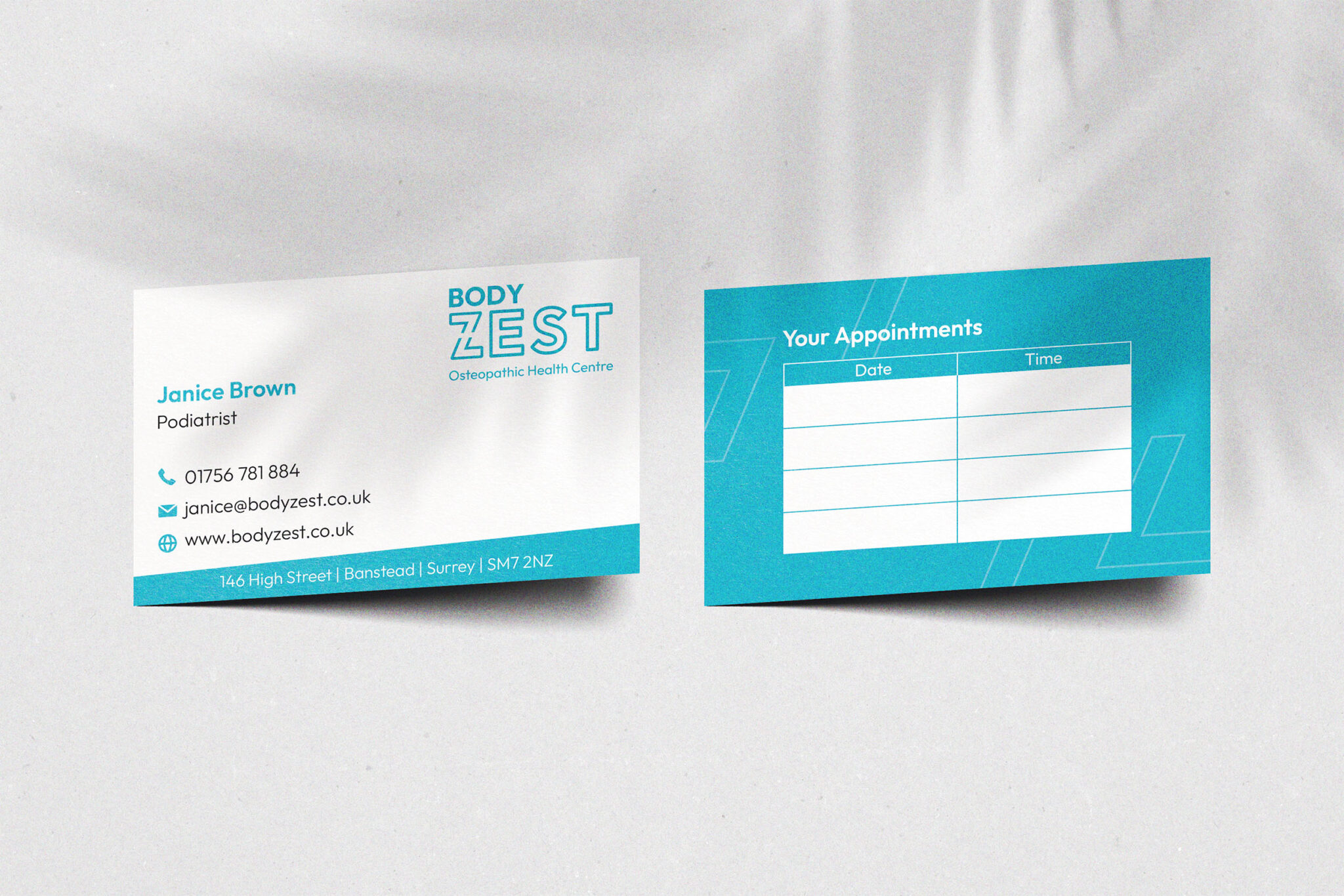
Brochures, business cards, appointment cards, silicone wristbands, digital assets — each one designed as part of the same system rather than adapted afterwards. The appointment card is a good example of the thinking: it’s the item patients keep in a wallet for weeks, so it earns brand presence that a poster never will.

Full brand guidelines were delivered covering logo use, colour specification, typography and application, giving the practice a reference point as it grows and works with other suppliers.

What we delivered:

  • Brand naming
  • Logo design and brand identity
  • Primary and secondary colour palettes
  • Typography
  • Brand guidelines
  • Print collateral including brochures, business cards and appointment cards
  • Branded merchandise