Brand Identity

Services
  • Brand Design
  • Branding
  • Brand Guidelines

A friendly identity for a local favourite

Bros Pets had built a loyal customer base in Sutton through knowledgeable service and genuine care. But their identity didn’t reflect that warmth. Our brief? Create a brand that customers could immediately recognise as theirs in person, on a shop sign, and across packaging. An identity as friendly as the team behind the counter.
A brand that speaks to pet lovers

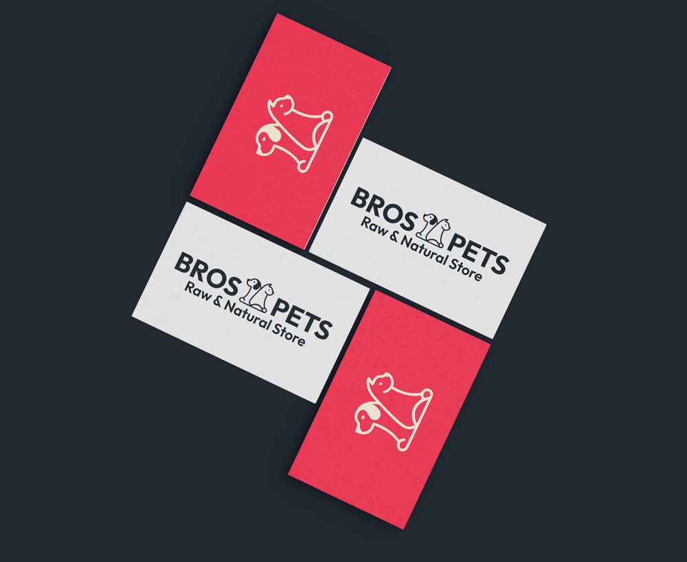
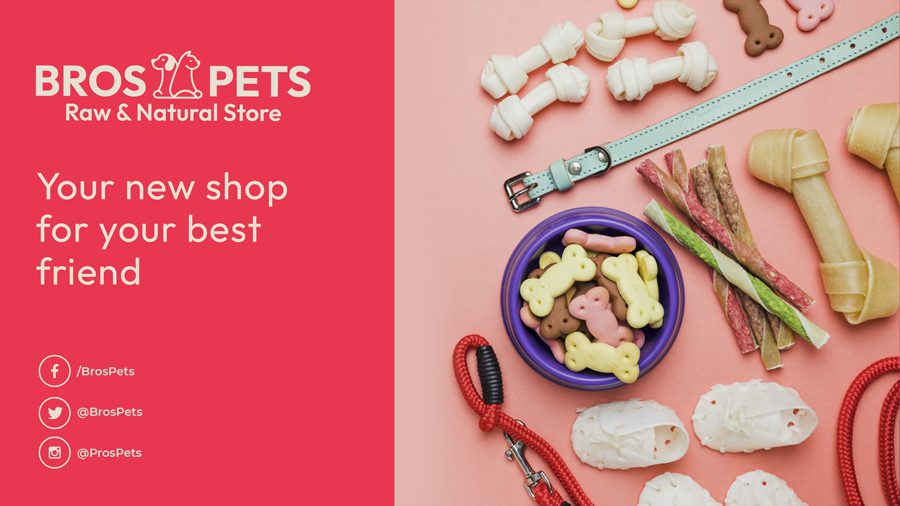
We developed a playful, approachable visual identity centred on two illustrated pets: a dog and a cat. These aren’t generic clipart animals. They’re character-led illustrations that feel personal sketchy, endearing, and full of personality. Paired with clean typography and a confident pink, the brand commands attention without losing its warmth.

The colour palette was deliberately bold. A vibrant coral pink anchors the identity, giving the brand a memorable presence that distinguishes it from competitors. Supporting tones (navy, teal, burgundy) add flexibility without diluting the core look.

Natural, useful brand tools

We partnered with a pink brand and deep brand toolkit created purposely for the foundation, giving the brand a personality that’s fun. To achieve this, we introduced a brand coral accent and a full brand expression. The logo mark can live large on a shopfront or small on a business card without losing clarity.

Simple, useful brand tools

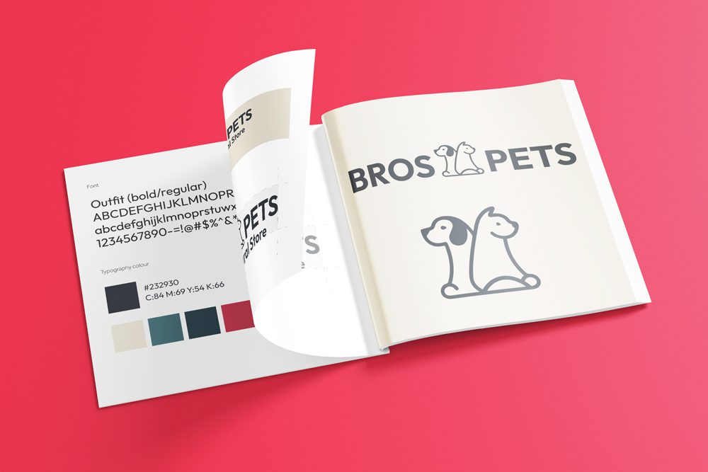
To support Bros Pets’ day-to-day needs, we created a brand guidelines document covering logo use, colour specs, typography rules, and logo applications. This helps staff and trade suppliers stay consistent, whether printing stationery, ordering signage, or designing promotional banners.

The guidelines also define layout principles and spacing rules making sure every application of the brand feels professionally handled.

What we delivered:
  • Logo design
  • Brand illustrations
  • Colour palette
  • Typography system
  • Brand guidelines